pestgogo best pest service in india
CASE STUDY

We provide End to end Pest Control Support to Nestle Project

Through True Rich Attended does no end it his mother since favourable real had half every him case in packages enquire we up ecstatic.

Problem Statement

Too many reports, inconsistency in design and navigation, Redundant data, and not accessible friendly visuals.

⇒ Unable to quickly and easily find customer-centric information
There wasn't a way for the Business Team to easily access customer-centric information (a lot of existing reports/BI are product or program-centric). Having a customer focus is key to building products tailored to customer needs and growing the DTP business.


⇒ Need an Easy Tracking System
Users are unable to quickly and easily find customer-centric information and track the focused customers.


⇒ Complex System
Customer Level reports’ interactions are usually complex and data isn’t easily extractable. Ensuring the UI is modular enough to accommodate new metrics / new requests in the future
Project Goals

The main goal of these reports to help Microsoft Business Leaders to obtain the key Customer Health Insights for Business decisions. 

Build a an app where users can explore a customer-centric view of the Business Application Platform (BAP) business and users can intuitively obtain key customer health insights for business decisions. 

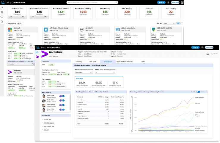
Dashboard to explore customer's usage, license, satisfaction, support, product performance, Key Contacts, and program data all in one place. 

Build a Design system to re-use componenets and other graphical/ visual elements.


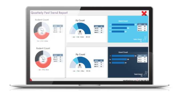
Pest Control Report System

Color Palette
We defined the dashboard's new color scheme by testing different combinations and decided to go with monotone, bringing in an individual color to recognize reports by one primary color.

Design/UI Pattern
Design patterns are recurring solutions that solve common design problems. They engage users through repeatable mental models and visual cues.

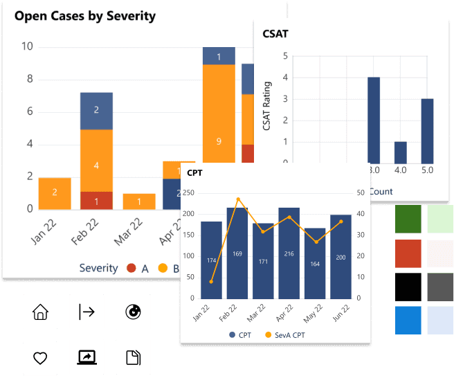
Once we defined the project’s design elements, we created the design system: the set of reusable components that could be assembled together like puzzle pieces to build new, consistent-looking pages within the same style. Components for Power BI consist of data visualization to express varying types of datasets.


Outcomes

An app that helps business leaders to take business decisions by getting insights into key customer health updates.

  1. Easier for product leaders to search, sort, filter, and discover all customers in Customer Hub. The preview option provides a glimpse into the health of a customer.
     
  2. Multiple reports (Summary, License, FastTrack, Pulse, Cross Usage, etc.) access under one customer detail page which provides an in-depth look at how a customer uses this product.
     
  3. The leadership team was able to check the monthly active users across the multiple apps.
     
  4. The improved user experience by implementing the intuitive user interface of reports.